Projects / Jörð.tech
Compliance is not reported.
It is produced.
Jörð.tech is a system of material intelligence for recycled-material value chains. I set the product strategy, created the brand and built the design system the product is made from.
- Role
- Founder & CEO
- Work
- Product strategy · Brand · Design system · Front-end
- Years
- 2025–26
-
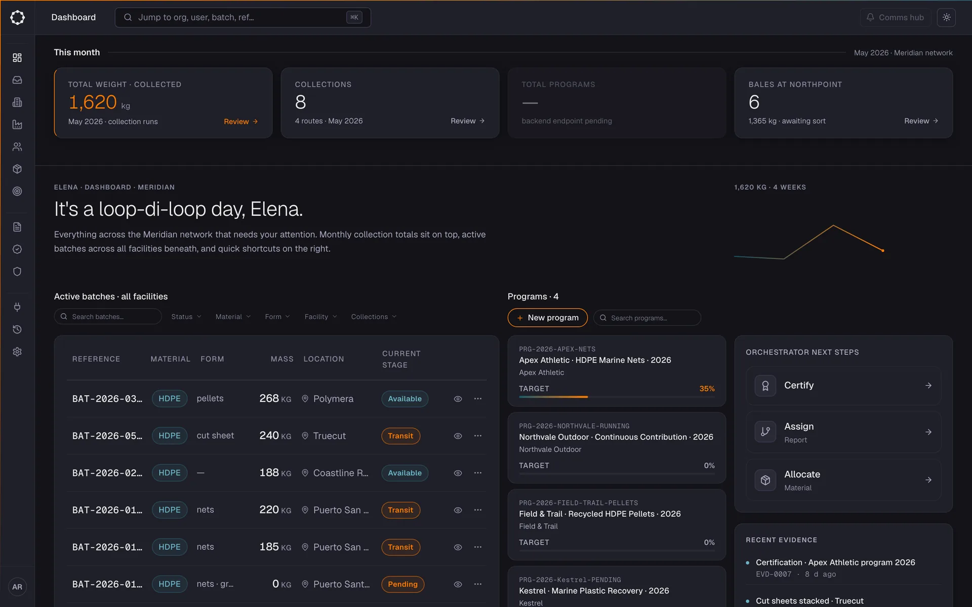
Orchestrator · Coordinate The orchestrator’s view of the network: what was collected this month, every active batch, every programme it counts towards. -
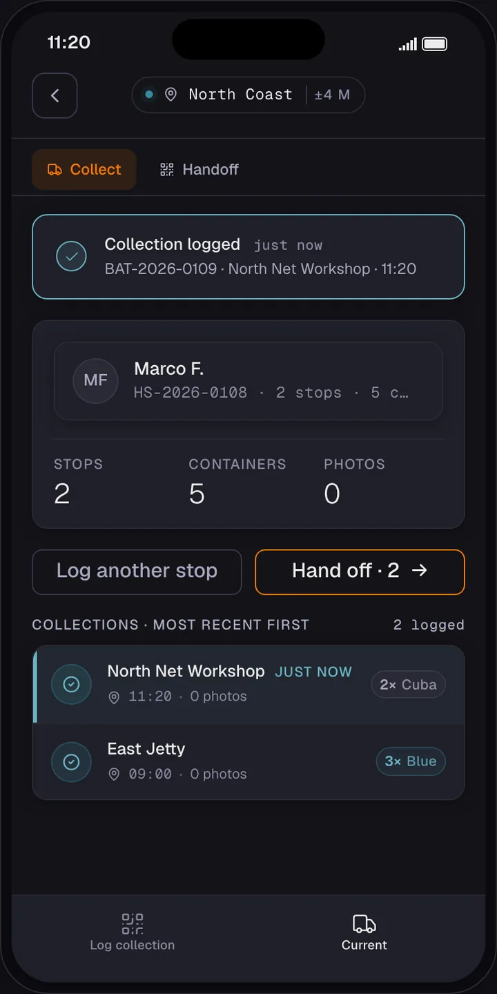
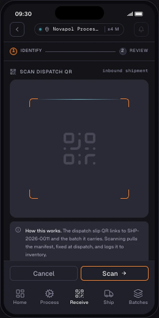
Driver & facility · Capture At the port each stop is logged with photo and GPS. At the facility, scanning the dispatch slip pulls in the manifest and logs the batch to inventory. -
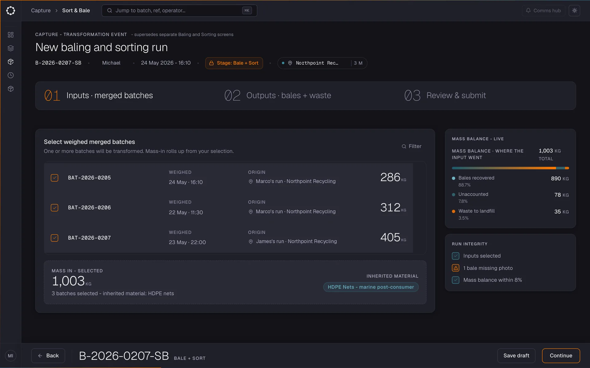
Facility · Capture Merged batches in, typed bales out, as one transformation event. The mass balance updates while the run is built. -
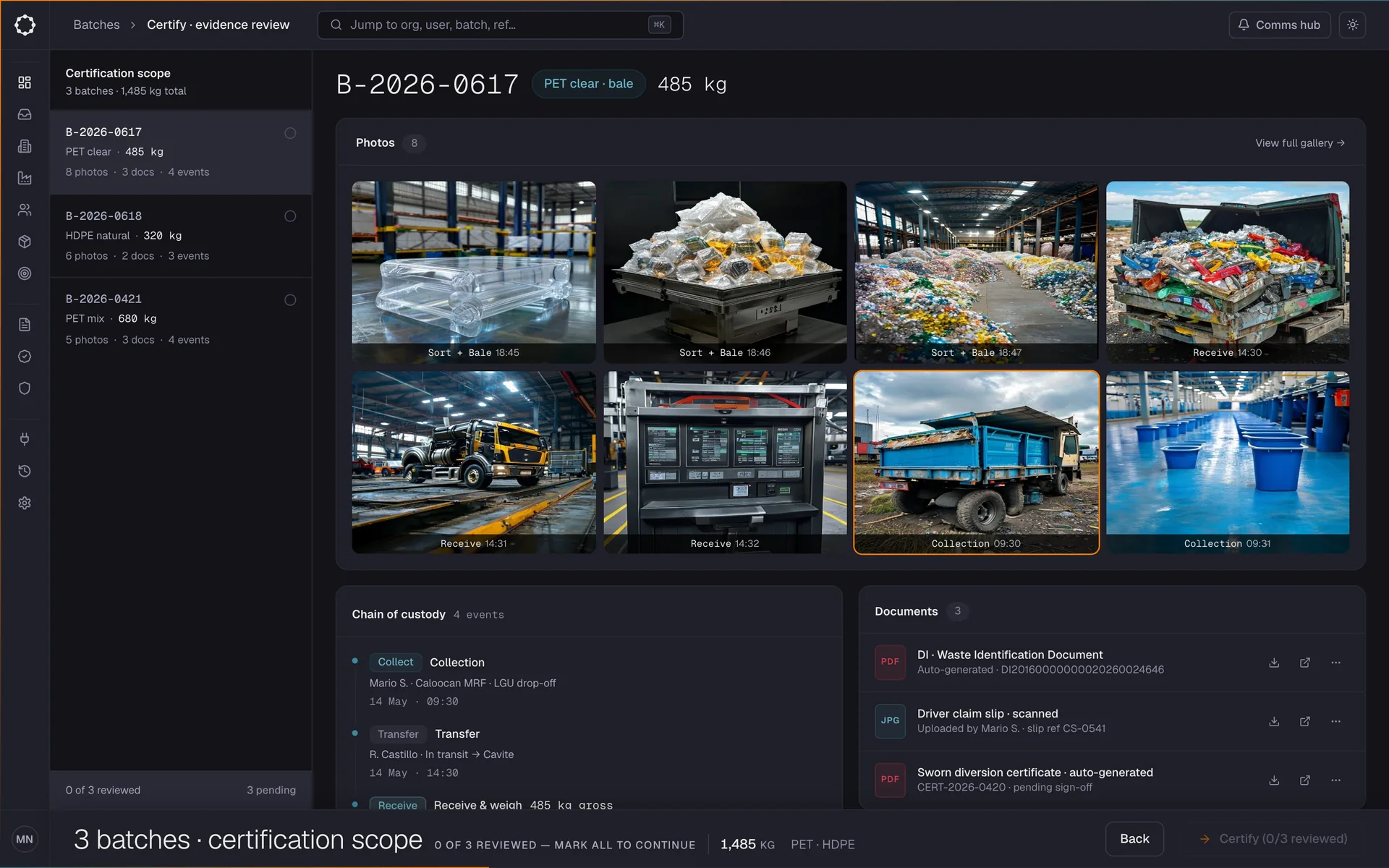
Orchestrator · Verify Every photo and document on a batch, grouped by the event that captured it, reviewed before anything is certified. -
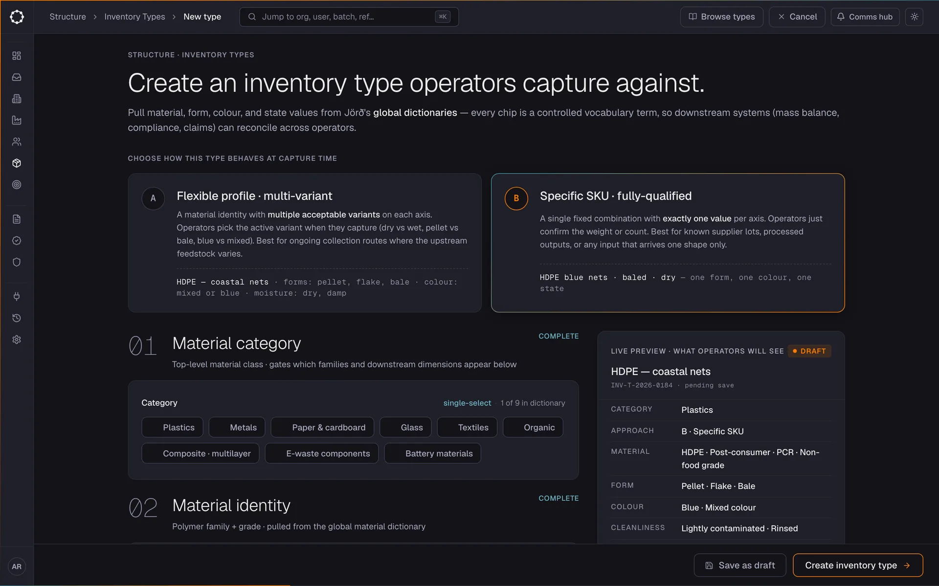
Orchestrator · Structure Defining what operators capture: material category, form and the values allowed, so every batch is described the same way downstream. -
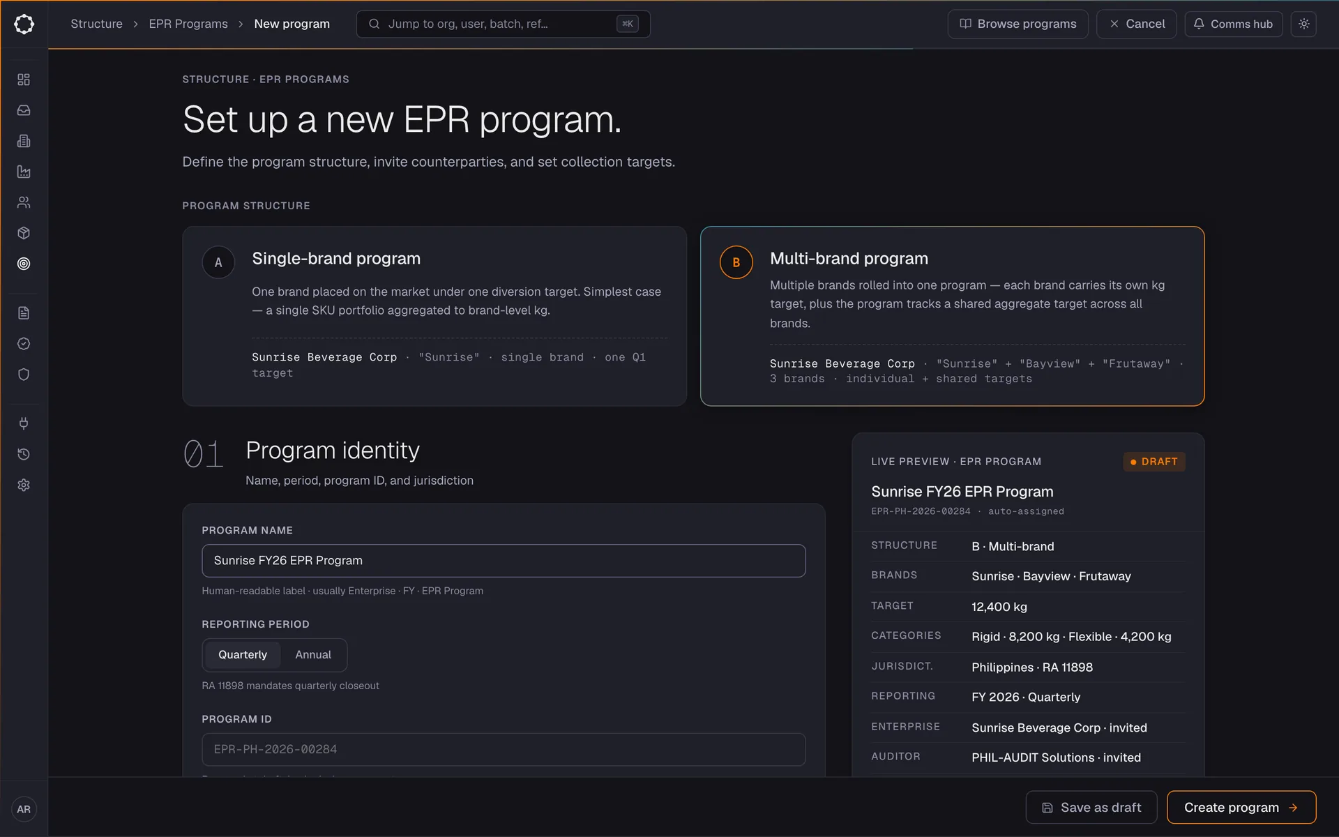
Orchestrator · Structure Setting up an EPR programme: structure, counterparties and targets, with a live preview of what is being created. -
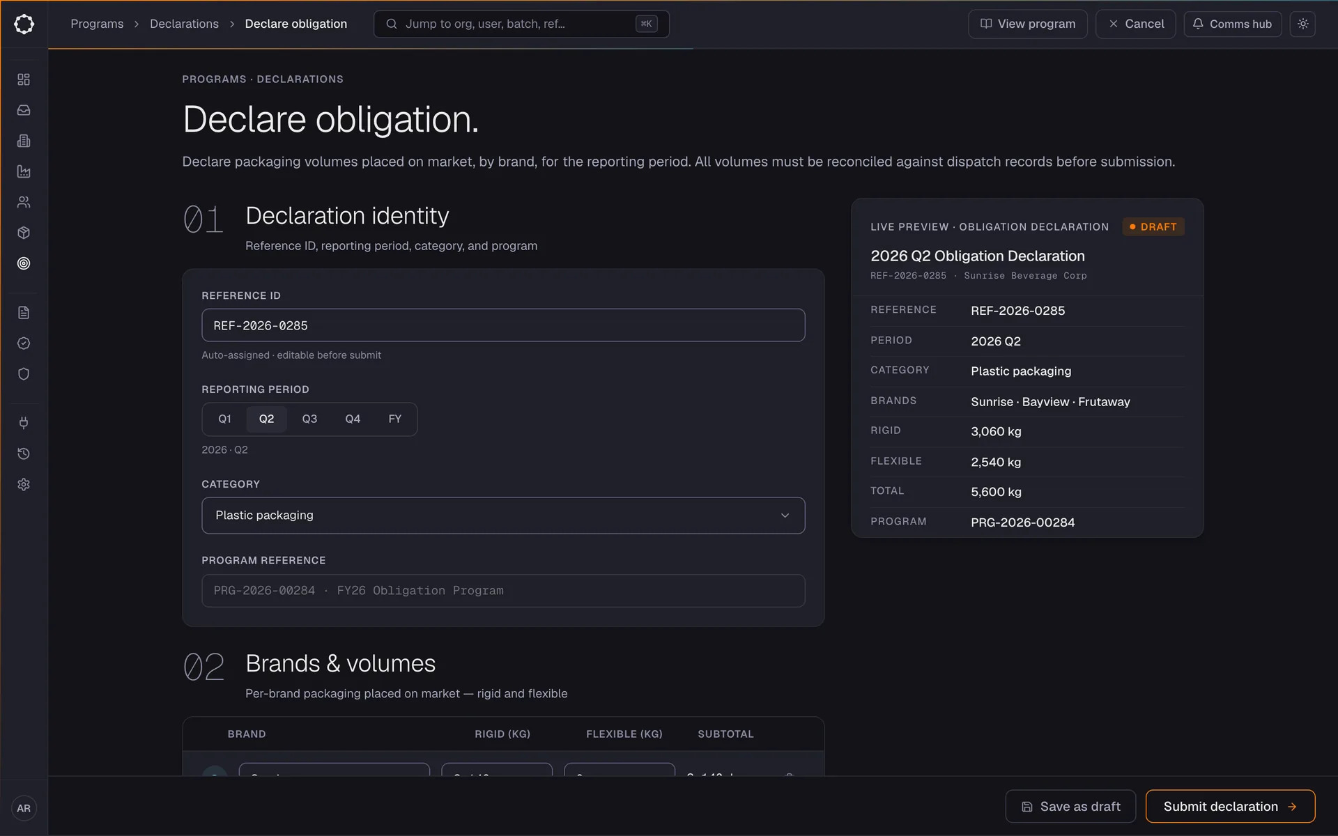
Brand · Structure The obligated brand declares its obligation: volumes by brand and category for the reporting period. -
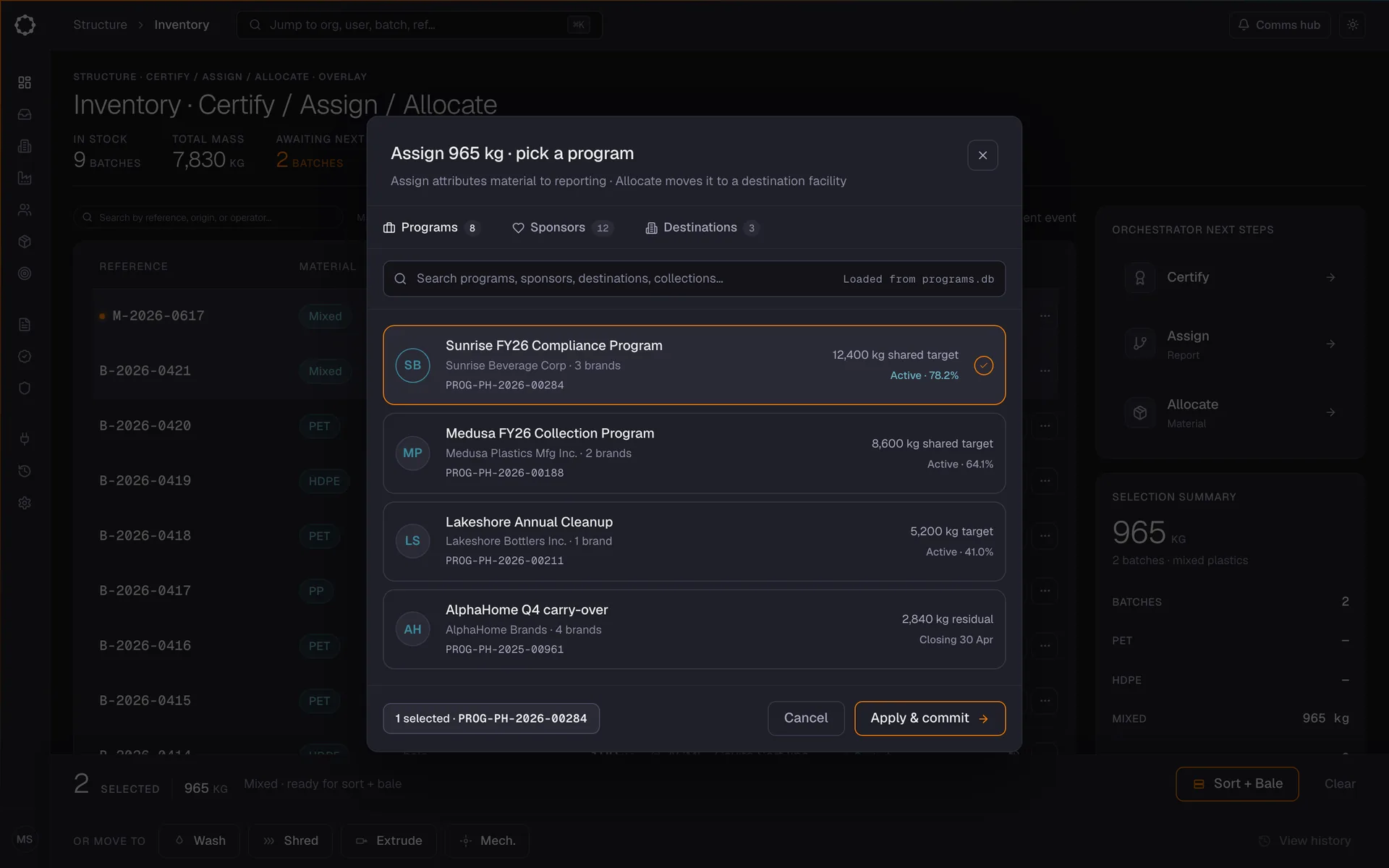
Orchestrator · Coordinate Selected material is allocated to the programme it counts towards. -
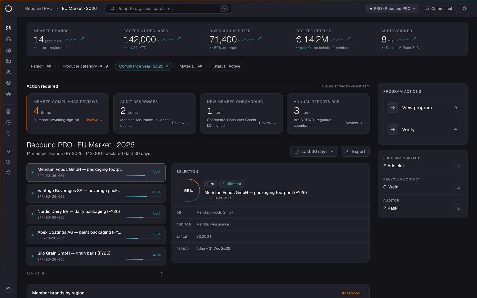
Producer responsibility organisation · Coordinate Every member brand’s obligation, declarations and audits in one portfolio. -
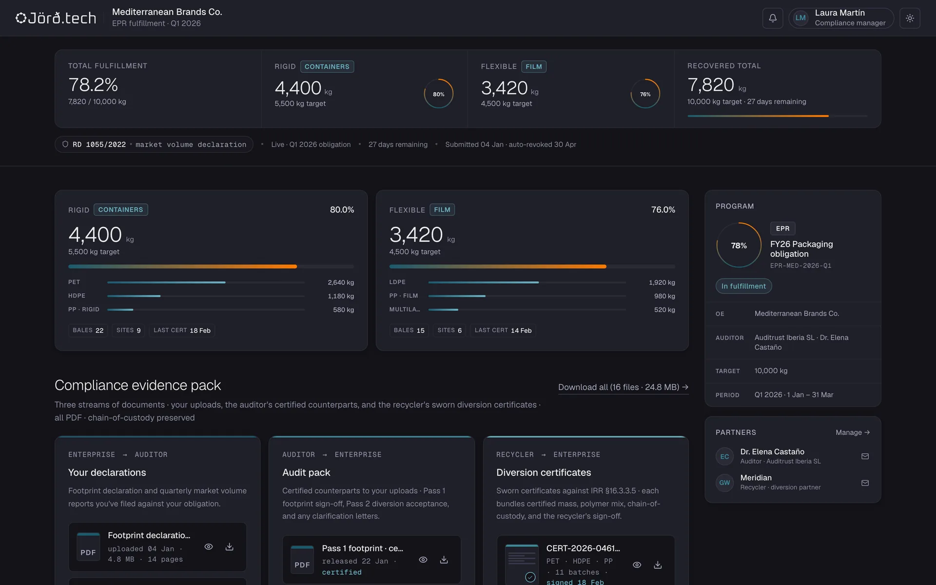
Brand · Evidence Fulfilment against the obligation, and one evidence pack: own declarations, the auditor’s certified counterparts, the recycler’s diversion certificates. -
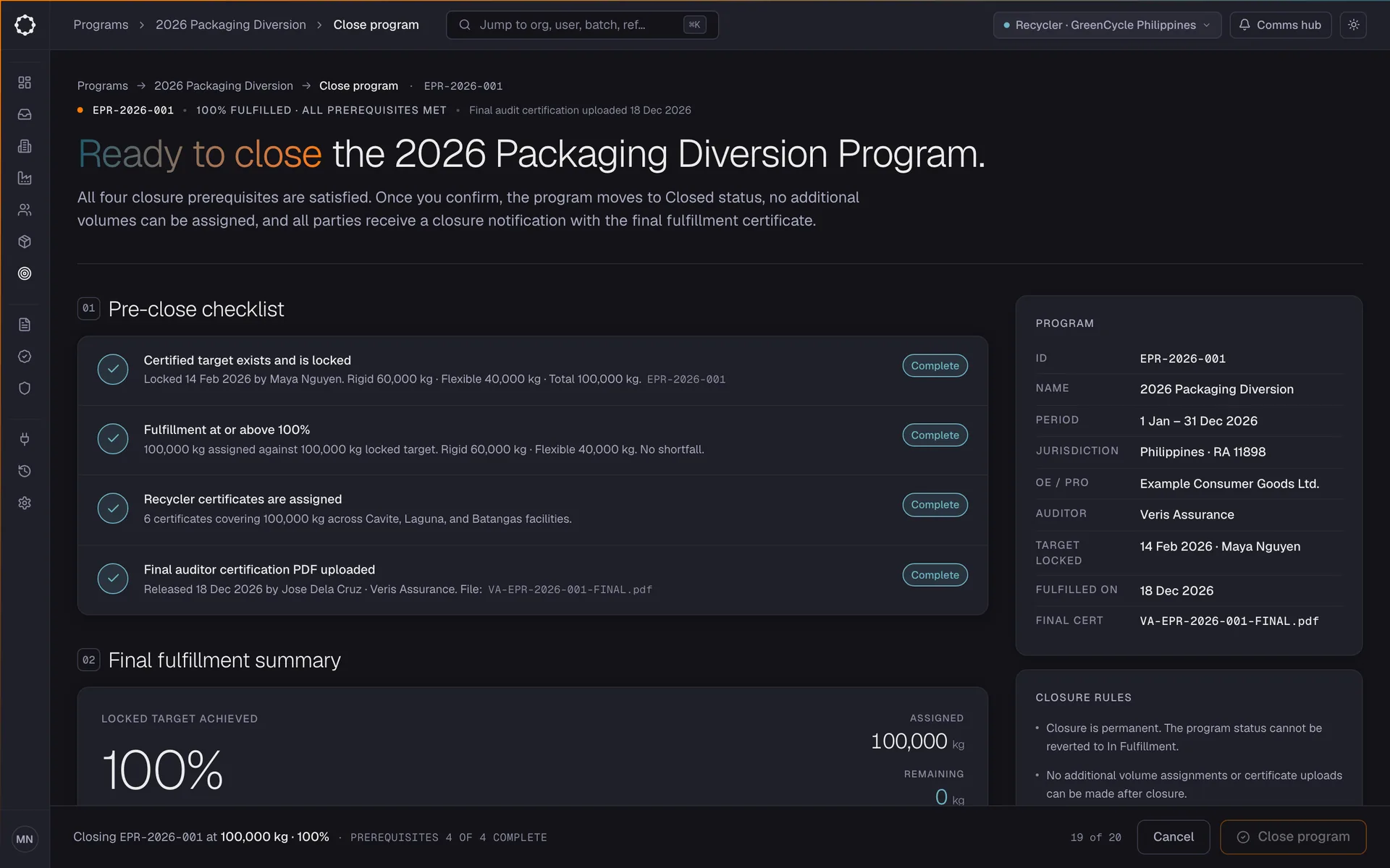
Orchestrator · Evidence Closing a programme once every pre-close check passes, with the final fulfilment summary. -
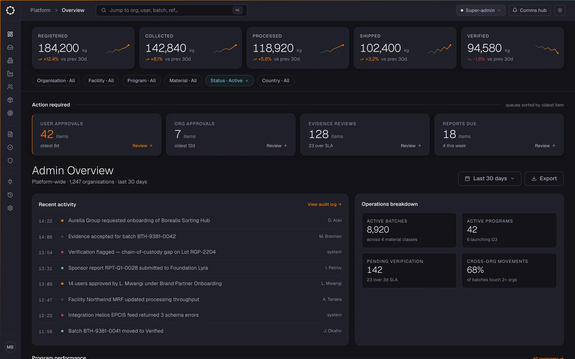
Admin · Structure The platform overview: approvals, organisations, evidence reviews and verification across the network.
01 The gap
Procurement teams, sustainability leads, and supply chain operators are asked to prove something they were never given the tools to verify.
Regulations are tightening. Disclosure demands are rising. Supplier networks are becoming more complex.
Most organisations manage this across spreadsheets, emails, PDFs, and fragmented systems.
The result is friction, uncertainty, and risk — not because companies lack intent, but because they lack infrastructure.
02 Core product philosophy
System of material intelligence.
One system, two principal data expressions.
Every record in the system traces back to a material event — something collected, weighed, sorted, transferred, or certified. Those events never exist in isolation. They live inside a programme: the governed structure that defines accountability, compliance value, and what each movement proves.
- Material the physical thing moving: lots, batches, custody flows
- Programme the governed context: obligation, compliance, certification
How raw activity becomes intelligence
Structure
Organises captured reality — counterparties, materials, transactions, batch logic, permissions, identifiers, and chain-of-custody relationships.
Coordinate
Makes the system operational, not archival — multi-party workflows, reconciliation, exception handling, inventory visibility, sourcing coordination.
Capture
Records what happens at the point of activity — deposits, collection events, warehouse inputs, partner inputs, machine and sensor data.
Verify
Makes data credible and defensible — evidence vaulting, audit trails, AI-supported verification, immutable records, privacy-preserving sharing.
Evidence
Expresses value downstream — compliance outputs, Digital Product Passports, reporting, ERP/PLM integration, and audit-ready outputs.
03 Screen design philosophy
Data-forward, enterprise-grade.
Numbers lead; chrome recedes. Colour lives in the data, not the interface. Signal marks actions and attention required — primary CTAs, items waiting on the user, fields needing input, alerts. Everything else is graphite.
Four navigator borders, one operating canvas.
| Border | Answers |
|---|---|
| Shell | Who am I / where am I in the system |
| Sticky top | What is happening / what do I need to do |
| Right rail | Where am I going |
| Sticky bottom | What do I do right now |
The operating canvas is the only thing that scrolls. All four borders are stationary reference points.
Signal marks attention, not scarcity
Signal orange marks the elements the user must look at or act on. It is not limited to one per view in data-dense screens; the rule is attention, not scarcity.
A regulator-grade data interface
No emoji. No gradients on backgrounds. No imagery. Gradients exist only inside data.
Programme or material
Everything happening in the system is either a programme or a material. Every actor is an organisation with a location and humans making decisions about things happening.
Reads like a regulatory liaison
Direct, professional, lightly formal. Reads like a competent regulatory liaison talking to a CFO who has 90 seconds.
04 Front-end
Design as code
No design files to translate. I designed directly in React and TypeScript, in a live gallery inside the code base, so an approved screen moves to production as code.
- FoundationsTokens for both themes, type, colour, spacing, data viz
- ComponentsAtoms, shells, charts and wizard primitives, each with variants
- TemplatesFrame-only shells for desktop and mobile, operator and orchestrator
- ScreensInteractive journeys, one file per screen, mirroring core’s domain model
- ProductHandoff by copying files and swapping imports
Interactive, not illustrative
Every user-journey screen is a mockup stakeholders can actually use: no dead buttons, real pending and success states, data that carries from one screen to the next. Three small hooks fake what the backend will do, and each maps one-to-one to its production replacement, so the JSX, handlers and state logic never get rewritten.
| In the design app | In production |
|---|---|
useMockOp(fn) | useMutation({ mutationFn }) |
useMockNavigate() | useNavigate() |
useMockStore() | API query hooks |
Rules a compiler can check
The domain model lives in the core service and the design app mirrors it verbatim: no
invented status values, no hard-coded record IDs. Screens compose only existing
components, with no inline styles. A clean tsc --noEmit is the exit
condition for every change, design work included.
// The same JSX ships to production.
const store    = useMockStore()
const navigate = useMockNavigate()

const submit = useMockOp(async (kg: number) => {
  await mockDelay()
  store.addBatch({ material: 'HDPE', kg })
})

<Button
  onClick={() => submit.mutate(weight)}
  disabled={submit.isPending}>
  {submit.isPending ? 'Saving…' : 'Save batch'}
</Button>

{submit.isSuccess && (
  <SuccessBanner
    onContinue={() => navigate('dashboard')}
  />
)}
Complication is complexity, misunderstood. Understand every actor and the systemic issue they share, and product design becomes logic in action.